christina laurel
installations...paper
  • home
  • gallery
  • installations
  • contact, press & links
  • blog
  • resumé

Artist Statement

9/29/2015

 
Picture
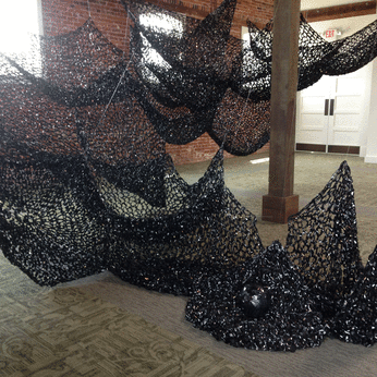
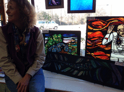
Writing an artist statement, especially for a specific exhibit, can be daunting. How to distill, to crystallize the swirl of mental and emotional processes that materialize themselves into a work of art? Here is what I submitted for an upcoming exhibit in Rochester, NY. Two series traveled from South Carolina to New York, both on cradled wood but one series is 36x24 inches while the other is 22x10 inches. My goal is to keep it short and accessible.

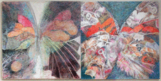
"A native of Syracuse, NY, I resided in Rochester from 2004-2012, often working out of the Anderson Alley Artist Studios. Enamored of the Edo period of Japan, an Asian aesthetic is visible in much of my work, whether cradled wood collages or site-specific installations. 'Edo Influence' and 'Remnants' share their verticality, and their search for a sense of balance. A balance of space and activity, composition and detail, quietude and energy.
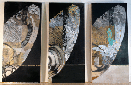
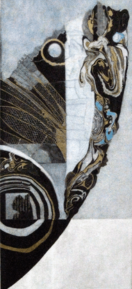
'Edo Influence' suspends colorful collage within neutral geometric planes and layers textural elements to create a Zen-like sense of balance. It is vertical; as a human, I am a vertical being. Each piece mirrors my personal search for balance: for private space amidst the noisy energies of daily life. 

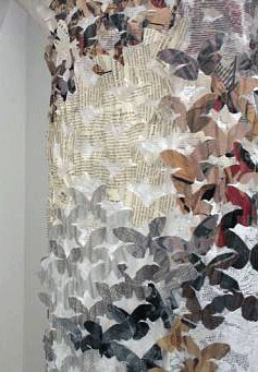
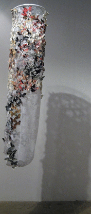
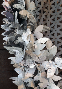
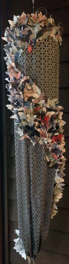
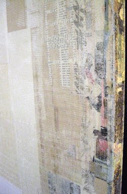
'Remnants' embodies awe and grief, two emotions I feel upon discovering a lone butterfly wing. Awe for their strength and fragility, grief for an individual death as well as the disappearance of a number of their species. Exploring the butterfly as a recurring motif is now into its fourth decade for me. Here, angularity meets curvature; human invention intersects with organic nature."


In the midst of creating the "Remnants" series, images of migrants fleeing their native lands at great peril are filling the airwaves. The poignancy, the compassion I experience while working on the butterfly wings are emotions akin to what I feel for those trodding for miles on new lands. It helps to voice these thoughts with trusted friends, one of whom shares what she sees, what she "hears" - having seen only one "Remnants" image via email.

"If you look at how you have put together disparate elements to create something beautiful...I can see it as a metaphor where you could think about migration." She is referring to the stages of the butterfly and connecting it to the human migration currently in the news." She continues by posing this question: "While we are each in our own cocoons, are we open to a metamorphosis that incorporates an inclusion of disparateness? Where each element retains its individuality, but together contributes to the creation of something beautiful?"

What an eye-opening, socially and spiritually conscious connection my friend makes for me. Yes, there is an awe for the migrants' strength and fragility, and grief for the death of a drowned migrant child. There is also a sense of hope in the beauty of a butterfly wing.

Butterfly memory

7/9/2015

7 Comments

 
Picture
In beginning a new butterfly series, I realize that I am in fact revisiting an ongoing one. Which begs the question: Why return to the butterfly motif? What is the germinating force, the original impetus that continues to draw me to the butterfly or perhaps the butterfly to me? Ah, this is where memory enters.

The memory of a first butterfly emerges slowly; as though appearing in the beam of a flashlight that is meticulously searching a dark room. It is a birthday party, about a block from my family-of-origin's flat on Rich Street (which was anything but) in Syracuse, NY, in the 1950s, at night, when I am 7 years old. It is the same party at which I play my first and only game of "spin the bottle." My commercial artist father - they are not referred to as graphic artists in that era - has painted a butterfly, a colorful contemporary version about 8x10 inches. This is the birthday present I bring to the party. The memory elicits dual sensations: pride and embarrassment. His artwork is lovely but handmade, not store-bought. It is poignantly symbolic of our family's talent-laden richness amidst its financial impoverishment.

In the 1970s as I begin to emerge into my own artist identity, my father's butterfly emerges from my subconscious. It serves as a template for visual exploration, as a vehicle to express my own metamorphosis. I watercolor and ink three dozen 18x24-inch butterflies; very few are extant, but I did have the presence of mind to photograph them. A few years ago I transferred the slides to digital format, subsequently spending hours cleaning, via Photoshop, the unwanted specks of dust.

The butterfly literally flutters in and out of my work over the decades. In 2007, it emerges as a subject to be worked in colored pencil, at which time I begin my "100 butterflies" series ("100 butterflies: 4, Night & Day" 2009, above). One wins an award with the Rochester Area Colored Pencil Club, another with the Rochester Contemporary Arts Center. Donation of butterfly artwork to Gilda's Club (a cancer support organization in Rochester, NY, where I volunteered in the art room) becomes my annual signature fundraising gesture.

Exploring the butterfly motif is interrupted by a return to college in 2008-2009 to complete my BS Studio Art. In the world of academia, I dare not consider the butterfly a serious subject. But when I hear "the father of biodiversity" E. O. Wilson speak about the disappearance of butterfly species, I am drawn to the motif yet again. In 2011 I hand-cut hundreds of butterflies the size of a business card, sew them onto suspended fabric, and exhibit this version in two solo shows in Upstate NY. Now I've done it: removed the butterfly from the confines of a sheet of paper, folded it into dimensionality, and set it in motion.

In 2014 I explore yet another medium with the butterfly: laser die-cut shoji paper. Paper is fragile; hand cutting is taxing. Japanese shoji paper is durable and translucent, and die-cutting produces a hundred butterflies efficiently. I attach the butterflies with brads to a 52x16-inch free-rotating suspended cocoon.

However, this year's "new" series pins the butterfly into the two-dimensional realm: collage, ink and paint on a 10x22-inch cradled wood substrate. The image focuses on one wing and only the upper portion, and is oriented vertically. The butterfly is no longer in flight; it is a remnant wing discovered on a path, an exquisite memory once moving in life, yet still moveable in death.

Oh, the butterfly is poignantly symbolic of duality: strong and fragile; immediately recognizable and imminently endangered. Perhaps my relationship with the butterfly is intrinsically linked to richness and impoverishment, but transformed into my present as beauty and ephemerality.

Note: new series featured in the previous blog posting

Picture
Picture
Picture
Picture
7 Comments

The beginning of a series

6/25/2015

4 Comments

 
Picture
After ordering three cradled wood panels measuring 22 x 10 inches each, I almost immediately order four more. A new series is birthing itself using one of my familiar motifs: the butterfly. Although I don't usually share works in progress, here are the first three of a series of...well, I'm not sure yet. In a sense, this new work is merely a continuation of a series "100 butterflies" begun in 2007.

But I've been using my butterfly template intermittently since the 1970s. While the silhouette is instantly recognizable, it is its compositional form - specifically, the arching of the upper wing - and its metaphorical qualities that I want to further explore here. By retaining the proportion of the wing as a constant in the composition, I can manipulate the foreground and background with mixed media to create variation. Variations on a theme; this sounds downright musical.

The artwork itself is a reprint of an earlier piece of mine, "100 butterflies: 13." Eliminating hue by printing it in value-mode allows me to reintroduce hints of color. I then adhere the printed rice paper onto the prepared cradled-wood surface. Next comes collage, suminagashi, inks, and acrylics to create each piece's uniqueness. The work on the far right of this "triptych" is the least finished of the three. 

Yes, orienting the wing vertically is intentional. It is not the orientation that our minds expect or anticipate. The original "100 butterflies: 13" hangs horizontally, but I am into all things vertical right now. The dialogue between myself and this new series has begun. It is a quiet exchange; I find that I have to listen attentively to hear what the work is telling me.

4 Comments

Artfields sparks a conversation

5/14/2015

8 Comments

 
Picture
Artfields in Lake City, SC, is in its infancy, having premiered in 2013. In 2015, it is now an ambitious infant-turned-toddler: 400 works of art, 9 days of viewing, more than 45 venues, scores of volunteers, workshops, tours and talks, music and edibles, walks and runs, and more. But my desire to arrive in this out-of-the-way rural town is prerequisite. I am curious enough to drive the 3-plus hours (each way) from Greenville for a firsthand look at this high-stakes venture. And it's a beautiful day on Monday, April 27.

I'm a believer in doing one's homework. By perusing the Artfields website, I zero in on the artists and art that pique my curiosity, creating a "don't miss list." Admittedly I do not see - nor intend to - all 400 works of art, as I overwhelm easily. The scale of Artfields is manageable though, because a majority of the venues are nestled within several of the quite walkable downtown blocks. 

Twelve southeastern states are represented, with 400 artists from an applicant pool of 1,000 accepted by an "independent panel of visual arts professionals." As I understand the process, the venues' proprietors then select which artists they prefer displaying. Which explains, for example, the socio-political theme running through the Jones-Carter Gallery.
Here is where it becomes even more interesting: Artfields winners are determined by popular vote and juried panel votes. I am allowed to vote for as many artists as I choose, but only one vote per artist, which I accomplish online at the Voting Center on East Main Street. I also cast a few more votes upon arriving home, via the website. Texting is yet another option. The top Prize rewards $50,000, the Juried Panel Prize $25,000, and the People’s Choice 2-D and 3-D awards command $12,500 each. I am unclear from the website's description just exactly how the top Prize is determined. High stakes indeed.

If you've segued off this blog to the Artfields website, you have glimpsed the winners. Before I embark on discussing the outcome, I want to share my experience of the event itself. For me, the warehouse-scale spaces appeal: the R.O.B., the W.A. McClam Livery Stable, and the Jones-Carter Gallery. The R.O.B. allows groupings of 2-D and 3-D via the use of partitions, and is spacious enough for installations. In full disclosure, I am partial to installations. Adrian Rhode's installation is suspended from the ceiling of the local Mexican restaurant Jarrito's, Mike and Patz Fowle's winning fish installation is tucked into an alcove of the Bold and Sassy Boutique, Sally Garner's crocheted VHS tape installation looms in the Livery, and Michaela Pilar Brown's challenging socio-political installation stands among several others in the Jones-Carter Gallery. If one's preference is a traditional framed landscape, I direct you to the Southern Distributing Company to peer over a gleaming white bathtub display.

Greenville artists are well represented: William Abbott, Ayako Abe-Miller, Alice Ballard, Zac Buser, Tami Cardnella, Matt Cook, Kim Dick, Darlene Fuhst, Heather Love, Hamed Mahmoodi, Charles Pate Jr., Betsy Powell, Judy Verhoeven, and Chris White. While none of our locals are prize winners, I can divulge that none of my favorites emerge as the chosen ones either. It appears that, for the most part, representational art continues to triumph. My favorite? A hard-to-find, in the back room of Main Street Mercantile, subtle non-representational piece by New Orleans artist Loren Schwerd, "Peak," comprised of nylon netting and thread. 

And my favorite moment? A group of women gather around a work of art in the Jones-Carter Gallery, with one commenting that "This is the only piece that is inspiring. The rest of the artwork here is a downer." To which another woman appropriately responds, "The artwork here represents the way the world is today." I don't linger to eavesdrop, but I am heartened that at least this art is sparking a conversation.

Picture
Picture
8 Comments

Architectural, more and less

4/19/2015

2 Comments

 
Picture
Lately I've been encountering the word "architectural" in reference to my own work, and been attracted to the architectural in other's work. Architectural? The word conjures images of structure, order, engineering, grids. I am more the Frank Lloyd Wright than Frank Gehry type, which is to say that I appreciate the elegant design sense of Wright more than the organic design sense of Gehry. 

If it is possible, I would love to see with fresh eyes my series of vertical collaged wood pieces. My reaction might be "architectural." But because each piece begins with the concept of balancing negative and positive space - with the negative claiming evermore space - and because the surfaces are built so naturally in layers, my view is not immediately "architectural." Yet they are.

And it is the architectural, as well as the minimal, in the work of Shlian, McAninch, and Schoonhoven that attract me.

Who? Matt Schlian (pronounced "shline") folds tyvek paper to create fascinating and precise artwork, both reliefs and sculpture. Schlian refers to his process as "misfolds," a reference to protein misfolding, which is too complicated to delve into further here. Within his website, I particularly appreciate the FAQs page which answers numerous questions running through my mind and will probably run through yours as well. In response to "tell me about your inspiration," Schlian writes: "I find inspiration in just about everything; Solar cell design, protein misfolding, Arabic tile patterning, systematic drawing, architecture, biomimetics, music, etc.  I have a unique way of misunderstanding the world that helps me see things easily overlooked." And there's more. What a treat to stumble across his work during one of my monthly forays to the Barnes & Noble magazine stand to peruse the latest art periodicals.

Claudia McAninch works with recycled cardboard to create 3-D wall reliefs and sculptural pieces. I discovered this artist's work at the 5th Anniversary Gala of the West Main Artists Co-op (WMAC) in Spartanburg, SC, where she has a studio. No artist website, but I do learn on the WMAC artists page that McAninch studied, what else, architecture in Germany. She continues to work with architecture and engineering firms there as well as in the US. To quote the site, "In her artworks, she mainly works on compositions of paper and cardboard which are deeply influenced by her fascination with patterns, structures, and textures." If the artist is reading this: please post images of your work on the internet for others to enjoy. Please.

And then there are Jan Schoonhoven's wall reliefs, also discovered during an art periodical perusal at B&N. These are not only architectural but incredibly minimal. How quiet can art become? Schoonhoven is no longer with us (1914-1994), although his grandson Jan Schoonhoven, Jr. carries the art torch forward, with a discernible family influence in his visual vocabulary.  The late Dutch artist is a civil servant in his country's post office by day, and artist at night who, in 1960 begins to craft "white reliefs of a geometrical structure." February 14, 2015, is the final day of an exhibit at New York's David Zwirmer, where "the first significant exhibition of the artist’s sculptural wall reliefs and works on paper in America in over a decade" are on view. White on white; simplicity expanded with textural subtlety.

Are my latest discoveries synchronous? I choose to believe so, as much for the validation that the "architectural" in my collaged wood series is a shared artistic manifestation. In the building of artwork, the negative space carries just as much weight as the positive space. Perhaps more.

Photo: detail of Christina Laurel's "Pushed to the Periphery" mixed media collage on board, 24x82 inches, 2015


2 Comments

Paul Klee

4/6/2015

2 Comments

 
Picture
On my 20th birthday my Father gifts me a small book, "Klee." At the time I consider it a curious present, as I don't recall having ever mentioned this artist. I tuck it in my art library, trusting its intent will reveal itself to me over time. "Klee" by Robert Fisher was published in 1966 and gifted to me in 1968. It is now 2015, and I remain unsure as to whether I'm attracted to Klee's work all these years because of this book, or if the book simply reinforces a decades-long natural attraction to Klee's work. I believe it is more the latter than the former, because several weeks ago I select a 1985 book, "Klee" by Will Grohmann, from the library shelves. 

Swiss-born and German-residing Klee was prolific but not long lived (1879-1940). Of the 9,000 works produced in 42 of his 61 years, he created 1,500 in the last 2 years of his life. I see a number of these works as conservation nightmares, such as the 1928 A Leaf from the Book of Cities done in oil on paper mounted on cardboard (I'm guessing the cardboard is not acid-free). Still, his prodigious output makes me wonder if the artist ever slept.

The multi-talented Klee was musician, poet, writer, and painter. Knowing this fact helps me immensely in seeing the synthesis he achieves in the two-dimensional world. His life spans two millennia, where the 19th into the 20th century witnesses a bridge from the neoclassical through Fauvism, Impressionism, the Blaue Reiter, Cubism, Surrealism, and the Bauhaus.

Even with these multiple influences, Klee defies labeling and manages to carve his initials into the history of art in a manner most unique. Yes, there were trips to Italy, to North Africa, to Paris, Egypt, and Spain, some inspiring more than others. Landscapes, letters, musical notation, portraits, dreams, architecture, animals...all rendered with a directness that bespeaks total trust in his artistic exploration. Pictographs like petroglyphs. Among my personal favorites: The Niesen, 1915; Once Emerged from the Gray of Night, 1918; Message of Autumn, 1922; Drummer, 1940; and Ad Parnassum, 1932 (pictured).

Grohmann, on page 26 of "Klee," shares the artist's thinking on the experience of viewing his work...actually, of viewing all art. Which is not to belittle the layman's perspective, as I hold a layman's view when partaking of a musical concert, a dance or theater performance, or even a team sport.

"The associations that are conjured up, Klee says, unfortunately cause many misunderstandings between artist and public, for the layman is always looking for similarities, the painter for underlying laws. Associations can be accepted by the artist only when they present themselves under their right names. Then he can complete the picture by adding something to it. The layman is always looking for similarities because he always starts at the end, from the finished form, not from the idea of creation, from creation as the beginning of all things. By contrast, the artist looks upon the optical image as a special case, limited in time and space, and prefers to go from the model to the archetype, to the 'primal ground of creation, where the secret key to all things is kept.' "

My curious 20th birthday present holds a secret key, but one which only Klee knows how to access and use. It is my task, as an artist born 8 years after Klee's death, to discover my own secret key and continue unlocking the primal ground of creation. Let the day begin!


2 Comments

Folding, not counting cranes

3/4/2015

4 Comments

 
Picture
Mountain fold, valley fold. Terms that make perfect sense when pressing forefinger to paper in the process of crafting an origami crane. Of which I have made hundreds, perhaps a thousand. I'm not counting.

When I am creating an origami crane, a common response by onlookers is, "Oh, have you read the book? It's such a sad story." For years now I have smiled, acknowledging the popularly-held belief that the folding of a thousand cranes ensures a healthy recovery from a terminal illness. Or so that is how I filtered the tradition, which I heard repeatedly. But no, I never actually read "the" book. Perhaps I am avoiding the sad story.

My origami practice involves gifting the crane to family and friends, as a way of imparting its positive symbolism: longevity, wisdom, prosperity, good health, and good fortune. The number of steps, or the number of folds, belie the simplicity of the finished product: 23. It is a technique best shared one-on-one, as even the concisest diagram or video segment can boggle the mind.

It is time for me to read "the" book. I opt for the closest version to the original "Kokeshi" published in the late 1950s, which is author Eleanor Coerr's "Sadako and the thousand paper cranes." I borrow the slim volume from the juvenile section of the library.

It is a sad story. Sadako Sasaki is a real person, a girl irradiated by the atomic bomb, dying at age 12 after completing 644 cranes. Sadako's classmates fold the remaining 356 for a total of a thousand, all of which are buried with the youngster. Her classmates do not stop here: they publish her letters and journal in "Kokeshi." In 1958, following grassroots fundraising, a statue to all the children killed by the bomb is unveiled in Hiroshima Peace Park. Sadako stands on top, outstretched hands holding a golden crane.

I warned you it's a sad story. Eleanor Coerr is inspired in 1963, while visiting Hiroshima Peace Park, to locate a copy of "Kokeshi." Although it is technically a published book, Eleanor discovers most of the 94-page, stapled originals are no longer extant. Years and fate intervene, a copy presents itself, the book is translated, and the author proceeds, publishing "Sadako and the thousand paper cranes" in 1987.

Why am I writing this post? Perhaps because on August 6, Peace Day in Japan, thousands of paper cranes are placed beneath the statue in Hiroshima Peace Park. Perhaps because, over a half century following the statue's unveiling, the world still gestures toward peace. I will continue to craft the origami crane, to appreciate its symbolism, and will gladly instruct you in its 23 folds.


Sidenote: While researching origami cranes, I discover contemporary artists, such as Linda Tomoko Mihara, who use the crane two- and three-dimensionally in ways that are best viewed rather than described. A word of caution: the plethora of origami-crane inspired art, both traditional and contemporary, takes you down a delightful wormhole.  

4 Comments

Bridging the gap between product and process

1/29/2015

3 Comments

 
Picture
Picture
Rochester-based artist Jeanne Raffer Beck and I are conversing long-distance about, what else, art. How can we bridge the gap between product and process, so that the viewers of art and the makers of art can better connect? Museum and gallery visitors stroll in, look at a painting, and then walk away. Where is the engagement? She poses a great question and immediately, in my mind's eye, I see a father and his two daughters staring at "Boy on a Horse" and drawing with No. 2 pencils.
 
You see, this family is attending Sketching in the Galleries, a community outreach event that is free and open to the public, as is the Greenville County Museum of Art itself. From 2-3pm on Sundays, museum-goers can attend concerts, listen to lectures, or participate in a hands-on activity. This is my fifth Sketching in the Galleries. I never know if a handful or roomful of walk-ins are going to appear; today there are 19. Each has a stool, sketchpad, and pencil.

I hear the comment, "He's so pretty, I thought he was a girl," several times from viewers of Sidney Dickinson's 1918 painting "Boy on a Horse." Admittedly the thought does not occur to me, as I peer at the slightly angular cheekbones hinting at a pending passage from boyhood to manhood. This is the painting I have selected from the Museum's "Alabama Suite" exhibit for my January 25 demonstration.

This event is not a solo act: public relations publicizes, museum guards assist, education department staff coordinates, curators prepare a handout, staff procures an easel, and so on. While I do not consider myself a portraitist, each of my choices for Sketching in the Galleries is indeed just that. My first was another Sidney Dickinson oil painting "The Pale Rider," followed by two Andrew Wyeth watercolors "Tundra" and "Captain Cook," and then an American Impressionist painting by Helen Maria Turner, "Girl with Lantern." This last choice gave me and the audience an opportunity to work with colored pencils.

Usually I translate oils or watercolors into graphite, where each one-hour demo is a concise drawing lesson. With "Boy on a Horse" I distribute tortillions/paper stumps for the purpose of blending the graphite. Tweens to seniors work on their 9x12-inch paper, surrounding my own 18x24-inch easel-mounted sketchpad. I cannot resist visiting each portrait, glimpsing everyone's unique style, commenting on an eye or a nose. I applaud the courage it takes to draw a first portrait, to become vulnerable in the process of learning.

Draw often, I exhort as I share the five attempts I've made to capture the likeness of "Boy on a Horse." The one posted here is, in full disclosure, an 18x24-inch created in my home studio using a photo of the work, a range of graphite pencils, and the grid system. Working at this larger-than-life scale allows me to delve into the details, to recreate the brushstrokes and hopefully capture the nuances. But even after completing this, just days prior to January 25, I return to the Museum for a one-hour sketch using only an Ebony pencil. I feel a sense of confidence and boldness that only comes with practice.

Ah yes, I'm rambling on about the event, about the materials and the process, but I've not yet shared information about "Boy on a Horse" or its creator. Sidney Dickinson (1890-1980) studied at the Art Students League where he later taught for a quarter of a century. He exhibited in the Northeast, was a member of the National Academy of Design, and served as a jury member. What is most relevant in relation to "Boy on a Horse" are his visits to the Calhoun Colored School in Calhoun, Alabama, where the model was most likely a student. Dickinson's parents worked at the school established by his maternal aunt Charlotte Thorn, who in turn was guided by Booker T. Washington. Elementary academics and trades (teaching, farming, cooking, sewing) were taught, beginning in 1892.

The preceding information is courtesy of the Museum's curator, while the following are my thoughts. The painting is dark, not uncommon for Dickinson, with a band of light on the horizon, either sunrise or sunset. The boy is mounted on a saddled equine, wearing a heavy coat, and glancing out of the picture frame with furled brow. I wonder if he has heard his name called? Is the band of light the dawning of peaceful times following World War I (which ended in 1918, the same year as this painting)? Is the boy looking back at his childhood while poised to move forward into manhood? Dickinson's paintings tend to harbor meaning, but there appears to be little information on this particular work. Thus, I allow my imagination to wander.

Like the participants in Sketching in the Galleries, I too attempt to bridge the gap between product and process, to connect with the artist's mind and the germination of his painting. Spending time looking, seeing, researching, imagining, and then taking pencil in hand - as Sidney Dickinson took paintbrush in hand - are ways to engage, to begin a journey not unlike the one the artist embarked upon almost a century ago.

3 Comments

An influsion of color...Kathryn Schnabel

1/13/2015

2 Comments

 
Picture
Picture
Picture
On a cold day like today where the light is filtered through a low-slung ceiling of white clouds, transforming everything into a monochromatic landscape, I welcome the colorful palette of artist Kathryn Schnabel. I also welcome her palette on cloudless days when light streams directly through Kathryn's stained glass mosaics. My introduction to her pieces is through her website, although there is nothing like seeing the genuine article ("Animator" and "Hillside in Window" are two examples). Isn't that true with any art form?

I believe that Kathryn's background in the graphic design and ad agency arena is partially responsible for her fearless approach to creativity. It's an arena that rewards brainstorming; playing with ideas and concepts in order to abstract relationships and associations, to create new linkages that click in either our conscious or subconscious.The fluidity of color swirling and moving across the compositions of Kathryn's mosaics, and of her silk paintings, releases a positive energy the artist willingly shares.

Kathryn herself references French painter Georges Roault, when discussing the dark grouting she utilizes in her stained glass mosaics. Interestingly, Roualt's paintings are often compared to stained glass because of his use of dark brush strokes outlining elements in his emotive work.

On Kathryn's website, you will discover the late artisan John Boesze who mentored her in glass technique. A technique that the artist has employed in numerous commissions, religious and secular, from the Midwest to the North Carolina piedmont. But it is Kathryn's ability to translate, for example, a client's request for a window or painting to be "biographical" or to celebrate a "life milestone" that marks the artist's signature style. She allows viewers their own relationship with the work, not just a literal interpretation with defined parameters she has established. I could say that there is a generosity in the work. The artist's ego serves the artwork, not the other way around.

If you need a dose of color to counter the gray of even a South Carolina winter day or would like to learn firsthand Kathryn's craft, visit the artist's website or visit the artist herself.

2 Comments

What's On My Desk

1/8/2015

6 Comments

 
Picture
What's on my desk? Two books and a brochure. "Suminagashi: the Japanese Art of Marbling, a practical guide" by Anne Chambers; "Show Your Work! 10 ways to share your creativity and get discovered" by Austin Kleon; and the January/February exhibition and program guide of the Greenville County Museum of Art. Now on with my explanation of "Why?".

The Suminagashi book is a 1991 edition brought to my attention by fiber artist Helene Davis of Paducah, Kentucky. It's a classic volume relevant to my upcoming workshop offered through the Spartanburg Art Museum's Art School. Unlike Western marbling, Suminagashi does not require additives to the water bath in which the inks float. I love the fact that although the inks can be manipulated, the resultant transfer of ink to paper is influenced by the very nature of water...its fluidity. No one print is like another. 

In the foreword of Chambers' book, Professor Akira Kuroaski writes about "sheets of decorative paper to create an aesthetic of perfect balance between the beauty of the paper, the calligraphy and the imagery of the poems" that were inked in 11th century Japan. A number of the "decorative papers" were done in suminagashi. Swirling inks, a moment captured in time, like a photograph without a discernible reference to the literal or the figurative. Suminagashi is simply floating ink snatched in its momentary evolution. Very Eastern.

Jump ahead 23 years to "Show Your Work" by the same author that brought us "Steal Like an Artist." I can't keep copies of the latter around as I am always gifting them. Both books are easy reads, just right for today's shortened attention span. Kleon is a self-described writer who draws, and who I first discovered via his blackout poetry, an exercise I've used (and credited) in creativity workshops. Pithy quotes, chalk-on-blackboard sketches, photographs, and lots of blackout examples make this 6x6-inch book an enjoyably graphic experience.

Kleon addresses a range of topics including the emotional vulnerability as well as business side of staging an exhibit. The author shares his trade secrets and encourages this level of collegiality among artists of all genres. Among his suggestions: send a daily dispatch; "A daily dispatch is even better than a resume or a portfolio, because it shows what we're working on right now." Share your taste via the work of others; "Your influences are all worth sharing because they clue people in to who you are and what you do - sometimes even more than your own work." And talk about yourself; "Have empathy for your audience. Anticipate blank stares. Be ready for more questions. Answer patiently and politely." 

Here's the chapter that surprises me - "Read Obituaries." I have begun but not as an exercise in morbidity. In Kleon's words, "Obituaries are like near-death experiences for cowards...Reading about people who are dead now and did things with their lives makes me want to get up and do something decent with mine."

Yesterday I sat in front of Sidney Dickinson's "Boy on a Horse," in the Alabama Suite exhibit at the Greenville County Museum of Art. I engaged passersby "patiently and politely" while sketching the soulful gaze of the youth astride a horse. I was here last week and will most likely take pencil to paper again next week, all in preparation for my demo during a Sketching in the Galleries session on January 25. The Museum provides Sunday drop-in opportunities that are free and open to the public, no preregistration required. During the sketching Sundays, visitors sit on stools, are loaned sketchpad and graphite pencil, and are treated to a mini drawing lesson from 2-3pm. Each week is different, with offerings of music, history, film, and demonstrations. Duke Energy is the series sponsor, but it is the Museum that should receive credit for initiating this level of community engagement. Bravo!

And best wishes for the new year to each and everyone.

6 Comments
<<Previous
Forward>>

    Christina Laurel -
    artist creating installations, working in paper.

    Enter your email address:

    Delivered by FeedBurner

    Categories

    All
    Art Process
    Art Venues
    Books & Periodicals
    Glimpses Of Greenville
    People
    Postcards From Paducah
    Resources
    Spirit Of Water Softness
    Teaching

Web Hosting by iPage