christina laurel
installations...paper
  • home
  • gallery
  • installations
  • contact, press & links
  • blog
  • resumé

An influsion of color...Kathryn Schnabel

1/13/2015

2 Comments

 
Picture
Picture
Picture
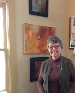
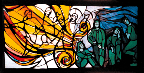
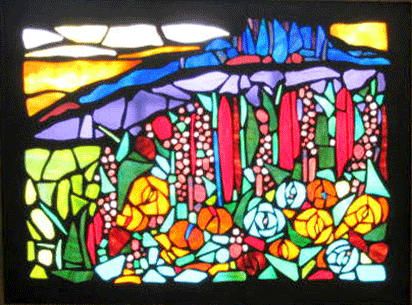
On a cold day like today where the light is filtered through a low-slung ceiling of white clouds, transforming everything into a monochromatic landscape, I welcome the colorful palette of artist Kathryn Schnabel. I also welcome her palette on cloudless days when light streams directly through Kathryn's stained glass mosaics. My introduction to her pieces is through her website, although there is nothing like seeing the genuine article ("Animator" and "Hillside in Window" are two examples). Isn't that true with any art form?

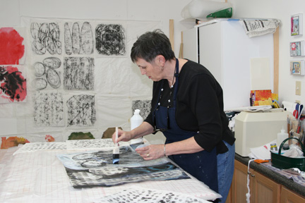
I believe that Kathryn's background in the graphic design and ad agency arena is partially responsible for her fearless approach to creativity. It's an arena that rewards brainstorming; playing with ideas and concepts in order to abstract relationships and associations, to create new linkages that click in either our conscious or subconscious.The fluidity of color swirling and moving across the compositions of Kathryn's mosaics, and of her silk paintings, releases a positive energy the artist willingly shares.

Kathryn herself references French painter Georges Roault, when discussing the dark grouting she utilizes in her stained glass mosaics. Interestingly, Roualt's paintings are often compared to stained glass because of his use of dark brush strokes outlining elements in his emotive work.

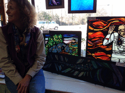
On Kathryn's website, you will discover the late artisan John Boesze who mentored her in glass technique. A technique that the artist has employed in numerous commissions, religious and secular, from the Midwest to the North Carolina piedmont. But it is Kathryn's ability to translate, for example, a client's request for a window or painting to be "biographical" or to celebrate a "life milestone" that marks the artist's signature style. She allows viewers their own relationship with the work, not just a literal interpretation with defined parameters she has established. I could say that there is a generosity in the work. The artist's ego serves the artwork, not the other way around.

If you need a dose of color to counter the gray of even a South Carolina winter day or would like to learn firsthand Kathryn's craft, visit the artist's website or visit the artist herself.

2 Comments

For the love of color: Carol Beth Icard

11/28/2014

2 Comments

 
Picture
Our world is full of color, but painter Carol Beth Icard distills her palette into hues redolent of earth, fire, sky and sea. Using oils mixed with cold wax, Carol layers the buttery mixture onto clayboard to build a luminous surface. Whether on a 6x6-inch or 36x36-inch substrate, the created effect is earthily familiar yet dreamily expansive. I will refer you to her own words, to her images best viewed in person, of course, but in lieu of this, on her website and blog. 

Artists are able, I suppose because of the nature of our work, to get to the heart of matters. When I visit Carol in Landrum, I know this is a dialogue we have anticipated via 1-1/2 years of email. In her dining room, Carol is surrounded by the artwork of colleagues, like being wrapped - as she expresses the sensation - "in the arms of friends." We smile; I feel the same in my own home. We progress toward her studio with hot tea to warm the slight chill of a November day. As we pass a large, colorful, atmospheric painting in the hallway, I do not suppress my initial reaction to compare her work to that of a 19th-century artist, and pose the question, "Do you like Turner?". Carol smiles in the affirmative.

Carol and I learn that we both have been nontraditional students, those who return to college in maturity; that we appreciate each other's work; that artist residencies are pivotal points in our artistic development (Carol's in Italy, mine in Paducah, KY); and that we are clear and confident in our focus, in our process. "Trust" is another way to phrase this. This is not to say that artists who trust their own voice are cocky, indifferent or egotistic. Rather, the critical voice of insecurity has been acknowledged and not invited to linger. Carol exudes a clarity around this, alongside an easy smile. We discuss the evolution of art processes and choices of media; art auctioned at fundraisers; the Spartanburg, Greenville, and Tryon art scenes; open studios; galleries; exhibits; prints versus originals; books; and more. 

Two hours have flown; tomorrow is Thanksgiving, and we part by exchanging business cards. Carol's are Moo cards; traditional-sized two-sided business cards, one side printed with any number of images of Carol's work. She ensures that I leave with a card depicting a detail of a work I have been admiring in her studio (the central painting in the photo above). Carol also gifts me with her book, "The Color of Words: Paintings 2005-2006." But it is the line in italics on Carol's business card that leaves a final imprint: "The finest art in life is gratitude." Perhaps this is the artist's spin on Friederich Nietzsche's quote, “The essence of all beautiful art, all great art, is gratitude.” Both are sentiments worth remembering as I drive the return trip to Greer, thinking of tomorrow, Thanksgiving.

2 Comments

Morning Glory in Charleston

11/18/2014

2 Comments

 
Picture
It is almost one year to the day that I first met artist Jocelyn Chateauvert in Charleston, SC. In 2013, I drove from the Upstate (Greenville) to participate in Artist U - a weekend intensive, part of the SC Arts Commission's Artists' Ventures Initiative. Jocelyn drove from Charleston to North Charleston; 28 other multidisciplinary artists arrived from the lowcountry and all points within the state. It was a pivotal, empowering career moment; best to read my November 2013 blog to learn more.

This weekend an arctic chill lingers on spanish moss and rain pocks beach sand; it's atypical. Jocelyn, a self-described "paper wrangler," and I share an immediate affinity due to a common medium, albeit translated uniquely. Jocelyn makes paper, then folds, twists, curls and manipulates the still-wet pulp into rich organic form. To add the descriptor "rich" seems redundant, yet it needs to be spoken because the artist does not replicate her source inspiration as much as imbues it with its own energy. Jocelyn reaffirms that she doesn't reference the source as an actual model. 

By now, if you haven't segued to Jocelyn's website, the question in the air is most likely - what does Jocelyn create? At the moment, flora such as super-sized lily pads, or morning glories suspended by their own paper vines and grouped to form an installation that debuted at Peter Paul Luce Gallery, Cornell College in Mount Vernon, Iowa (Jocelyn's native state). White morning glory blossoms that capture light and cast shadows and, what you cannot experience on the artist's website, that generate sound as they contact each other. A dry rustling of strong, three-dimensional paper.

We climb the staircase in Jocelyn's home to the studio in which she transforms her paper into two- and three-dimensional artwork. I am surprised the studio is not larger, given the scale of her morning glories but, as I also create elements for installations in a small studio, I understand. We pause on a landing, Jocelyn opens a window to reveal a 400-year old tree, and explains this was one of the major appeals in acquiring the house. Later, when we are in Jocelyn's wet studio, she opens a closet door to retrieve a beautiful handmade papermaking frame (mold and deckle), one that will, in her own words, be usable for 300 to 400 years. I am beginning to sense her respect for time, of honoring the legacy of a tree, and even of a tree now crafted into a wooden frame. It feels Japanese to me, an aesthetic and appreciation for the past as it moves into the future.

In the downstairs wing, accessed via an outdoor porch, is Jocelyn's wet studio with paper blender, tubs, mold and deckle (frame), and press. If we had time, we could make paper, Jocelyn exclaims. It is hard not to catch her enthusiasm and yet I feel my hesitancy, only because each new art medium opens a door to endless learning and experimentation. And I tend to focus on my own processes and types of paper (e.g., shoji), wanting to do more, go further, a bit tentative about becoming distracted.

Paper is a fascinating medium; ephemeral yet capable of outliving us, soft and pliable but also crisp and firm. Even in our digital age, we use and encounter paper daily. It is a staple taken for granted but, luckily for the world, is visited with new sensibilities by artists. Like Jocelyn. 

Admittedly I am impressed with Jocelyn's artistic journey: SC Arts Commission’s 2005 Craft Fellow; Smithsonian 2010 Artist Research Fellowship; exhibit and artist talk at 2013 Artfields; paper construction demo at Museo della Carte, Fabriano, Italy, during IAPMA 2014 conference; a recently installed commission "The Space in Between," suspended in the SC State Museum's planetarium; and more. What interests me now is the continuation of Jocelyn's journey: paper that has not been made or manipulated; ideas and nascent forms that have not yet materialized. I won't wait another entire year before rediscovering this artist!

Picture
2 Comments

Connecting at art auctions

11/13/2014

2 Comments

 
Picture
What exactly does this mean: connecting at art auctions? Simply stated: I introduce and reintroduce myself to, and converse with, artists during two art auctions. This interaction Is the best part of each evening. The worst is the discomfort of watching art bids below market value, while artist donors observe. But this is an entirely separate posting, for another time.


At a fundraiser for Greenville Hospital System's Cancer Research Institute, hosted by Frame Warehouse in Greer, SC, I settle into a conversation with photographer Janet Barnes, while appreciatively munching on a slice of her pistachio-coconut cake. Tom Rickis, painter and president of the Artists' Guild of Spartanburg (of which I am a member), is also present and always ready to share Guild news. He is encouraged by the increased level of in-kind donations for the second annual Artists Going Live event, which is a "fundraiser for the arts."

The Artists' Guild of Spartanburg is holding the event at the Chapman Cultural Center in Spartanburg, SC. During my October artist residency in Paducah, KY, I describe Spartanburg as a sister city to Greenville and, although I like to think this is an apt term for the urban centers' relationship, it may be more hope than reality. My experience to date reveals two separate circles of artists with very little overlap, although I'd love for it to be otherwise. Please correct me if this perception is false.

Connecting at art auctions, at the Guild's Artists Going Live: paper artist Carol Funke, pen-and-paper artist John Hill, bead artist Melissa Earley, and painter Deborah Jane Wall. All Guild members demonstrating "live."

Carol Funke is on my list of people to meet, because I seek out artists who work in paper. Carol is a paper maker who reassembles her components into relief-style wall pieces. I am instinctively drawn to her textural white "Circles" - one in a series based on the circle, triangle, and square - and delight when the artist invites me to touch. Only now, back home, do I realize that I missed her handmade paper workshop earlier today at OLLI (Osher Lifelong Learning Institute/Furman University). But I am glad to finally connect the artist with the work.

John Hill arrives tonight with a partially-begun pen drawing that finds its completion well before Artists Going Live is nearing a close. I've missed his live performance but have been drawn (hmmm...pun here?) to his work previously. Upon initial sighting, I conclude - falsely - that his relatively small drawings are computer generated. They are precise, inventive, and a heck of a lot more interesting than zentangles. These technical pen creations are akin to doodles that both wander and congregate, in the manner of dreams. Can I check out your sketchbook one day, John?


Melissa Earley is stitching large black and white beads, creating another in her series of Enlightened philosophers' portraits. The artist shares that she majored in philosophy, likes the pixelation effect generated by the scale of these beads, and the fact that the portraits only reveal themselves at a distance. You'll see on her website how Melissa moves from drawing to painting to beading. And that she also creates portraits with colorful minuscule glass beads - 285 per square inch (!) - using a traditional Native American stitch.

Deborah Jane Wall answers my question before it forms completely: "The black specks are charcoal." The black specks are indeed a dynamic, dimensional aspect of Deborah Jane's painting - an energetic plane of blues, greys, and white. (Sorry, I couldn't locate your Facebook page.) I ask that she talk about the work she has created within the past hour; the artist confides that she was nervous (who wouldn't be, performing extemporaneously?), not knowing what would emerge tonight. I sense that Deborah Jane rode the surfboard of her anxiety confidently over the waves of uncertainty. She is smiling. 

Yes, the best part of art auctions: connecting with artists.

Picture
Picture
Picture
2 Comments

Blog Hop - introducing Allison Anne Brown

11/12/2014

2 Comments

 
Picture
A former student of the Fine Arts Center, the South Carolina Governor's School for the Arts, and the University of South Carolina (BFA), Allison received a strong underpinning to her explorations in sculpture. As with many artists, I met Allison's work prior to meeting the artist, and am impressed with both. Within the organic forms Allison crafts, I sense a barely-contained expandable energy, elegantly raw. The artist used both a live model, and self-generated photos of same, in creating "Hatshepsut" (pictured). During this year's Open Studios at Taylors Mill, Allison (pictured) shared in a passionate voice her love of all things "art." I am pleased that she is sharing her voice via her art and her blog: 
http://www.allisonannebrown.com/blog

Picture
2 Comments

Blog Hop - Christina Laurel, and Allison Anne Brown

11/12/2014

2 Comments

 
Picture
I am grateful to textile artist Terry Jarrard Dimond for inviting me to join this blog hop. She in turn received her invitation from Judy Kirpich; the blog hop was initiated by Kathy Loomis. http://studio24-7.blogspot.com, http://unmultitasking.blogspot.com, http://artwithaneedle.blogspot.com.

A blog hop is a vehicle for increasing exposure to artists' blogs and ultimately to the artists themselves. It is a collaborative effort that allows us to introduce ourselves to each other and to the world, and then to highlight another artist. My choice for the "passing of the baton" is the blog of sculptor Allison Anne Brown, a young up-and-coming artist based in Greenville, SC. I've created a separate posting for Allison's photos and a bit more info.

Now to the four questions: What am I working on? How does my work differ from others of its genre? Why do I do what I do? How does my process work?

1.  What am I working on?
Following the month of October as Artist-in-Residence with the Paducah Arts Alliance, Paducah, KY, I am now working on an installation for Greenville, SC. Technically, I am a mixed-media artist who works primarily in paper. I've also been described as a fiber artist. My current choice of paper is shoji: I precoat it before inkjet-printing, then have components, e.g., gingko leaves, die-cut. These are assembled into suspended free-rotating "cocoons." I also use additional media - textiles, metal and wood armatures - any material that achieves the effect I am seeking. That effect is translucency, layering, ephemeral. Each suspension is at a human scale, not overwhelming. As each installation is site-specific, the basic components are reconfigured in relation to the venue, and to the mood of the geo/social location. To explain a bit: Paducah's rivertown pace differs from Greenville's metropolitan pace. The installation in Kentucky reflects the mood of "quiet yet energetic," while the installation in Greenville will offer more "quiet" to counterbalance its urban energy.

2.  How does my work differ from others of its genre?
When people hear that I work in paper, a number of assumptions surface: drawing, folding (origami), and handmade paper. When I am identified as a fiber artist, the assumptions include: textiles, thread, sewing. My work does incorporate a number of these mediums and techniques, but also freely utilizes others. While I continue to create on-the-wall pieces, five years ago I began removing my artwork from the frame. With installations, the work is off the wall and suspends from the ceiling. 

3.  Why do I do what I do?
This is a really good question, because a number of my friends (artists included) do not understand why I create installations. They are labor intensive; they go up, they come down. To date, no one has purchased an installation or part of an installation. I respond: for the experience of the gallery-goer. In October, I created a 9-foot walk-in suspension and discovered its interior peacefulness. Here's a pic with abstract artist Rosemary Claus-Gray inside.Responses by others range from "fun" to "serenity" and, at its premiere in Paducah, KY, gallery-goers were taking cellphone-videos from inside the walk-in as it slowly rotated. The installation as a whole is intended as an oasis from our daily sensory bombardment; an "exhale" moment. 

4.  How does my process work?The work begins as a concept, without preliminary drawings, utilizing a particular set of materials. It proceeds as a "dialogue" between artist and artwork until it appears to  resolve, hopefully before it is overworked. I want the energy involved in the process to remain palpable in the final product. During my residency, I experimented with not only the die-cut gingko leaves but also with their carrier sheets. The play of positive and negative, a layer of machine-lace, an embroidery hoop armature - all resulted in one of the most ephemeral "cocoons" I have created to date. And the most difficult to photograph for this same quality.

Picture
Picture
2 Comments

Looking at Loss

8/25/2014

1 Comment

 
Picture
Creativity has everything to do with making things. Loss conjures up the negative space surrounding creative acts. The past few weeks are so entwined with both, that writing requires some sort of mental and emotional tool I know not its name.

Loss: my Mother on August 14. Creativity: acceptance into the Artists' Guild of Spartanburg's 41st Juried Show on view in September. Loss: grief, grieving. Creativity: acceptance as Artist-in-Residence with the Paducah Arts Alliance in October. Loss: my last surviving parent. Creativity: grief as inspiration.

My Mother was a talented draftsman. Which is to say that I saw her strength in drawing and sumi-e and painting as the ability to render what she saw. In my teaching, I share her ink brushwork of koi, sparrow, and flowers as an example of what is possible. I unroll her precisely drawn pencil study of a desk, chair and lamp that conform neatly to two-point perspective. "This is what it looks like," I say to my adult students. She studied at Syracuse University in the 1940s until she met my father. Then she created six children.

I have been creating since I first dipped my digits into fingerpaint. My Mother patiently viewed my childhood endeavors until they morphed over time into the artwork I craft today, images viewed on my laptop. Truth be known, in the last months of her life, it was babies, dogs, rabbits, birds and nature that tickled her most. Not art; nature.

But creating art is my nature. The "tool I know not its name" has pried open a fissure into which I pour the black of my grief, but out of which erupts the purest of lights. What newness will this light reveal? I'll get back to you in October.
 

1 Comment

More about Jane Notides Benzing

3/7/2014

1 Comment

 
Picture
Picture
Naturally, following my last blog on the kitchen table, you are curious about the work of Rochester, NY-based artist Jane Notides Benzing. Above is a recent paper sculptural relief that is currently in a national show, "From the Earth: glass, clay, paper" in the Tubac Arts Center in Arizona. In response to the juror's question, "What is unique about the use of paper?" Jane replied: "In my paper sculpture, Diana Hunting in the Woods (above photo), the absence of paper - bullet-like holes - fulfills the narrative and gives a destructive and contemporary edge to an ancient story." The 12x12x5-inch piece is constructed of Arches paper treated with watercolor and ink, then coated with UVL protective varnish, and wired on the back for installation.

As I told Jane today, I am partial to her paper work as well as the Tubac Arts Center - a personal favorite, having visited there as an Arizona resident decades ago. Nonetheless, her acrylic-boxed work is intriguing in its own right. The photo below is reflective of a new series Jane is developing, Playing in Clouds, three-dimensional layered pieces encased in 14x12x4-inch acrylic. This one employs wires, sheer fabric, beads, and other media.


Of course there is no replacement for seeing the original work, so, if you're in Tubac within the next month...

Images provided by the artist.

1 Comment

dancing on the wall

2/28/2013

2 Comments

 
Picture
I feel as though I have walked into a pristine yet primal forest. A sophisticated landscape at its peak, with a hint of the onset of decay. Of the natural life cycle where I am the recipient of the gift of oxygen as the vegetation processes the carbon monoxide silently for my benefit. Such is my experience of the work of Clemson, SC-based textile artist Terry Jarrard-Dimond in the Sheffield Wood Gallery at the Fine Arts Center.

Jarrard-Dimond has recently spent a weeklong residency at the FAC, about which you can read more and view pics on her blog. In one corner of the Gallery, on-loan fabric swatches show different surface design treatments by the artist and some of her colleagues - this is the educational component of the exhibit. I tend to read the artist's statement after breathing in the work, so that I am not predisposed to interpret through her eyes rather than mine. Perhaps the first preconceived notion to be tossed out the window relates to the nature of the quilt, of quilting itself. The stitches that bind these disparate pieces of fabric are not your great-grandmother's. Some are functional, some are mere mark-making. One can just as easily see Jarrard-Dimond's pieces as paintings on canvas.

From the artist's statement...
"The evocative power of abstract and nonobjective imagery is at the heart of my work." True, as the greens and verticals evoke trees in my imagination.

"Compositions develop through the process of action and response as I dye, paint, cut and restructure fabric." This is the dialogue I often describe to my own students as taking place during the creation of a work of art. First there is an idea, then the initial mark or piece of material is laid on the canvas, the paper, or fabric. From this point forward the conversation may remain focused but take many detours before reaching its destination.

"I like to think of my work as textile construction and the content as interior landscapes." Because Jarrard-Dimond exhibits her work from the past 5 years or so, I glimpse the path of her evolution. The use and placement of color becomes more subtle and refined over time. Machine- and hand-stitching dance the waltz as well as the tango. The scale of the work - approximately 4-feet square-ish - remains a constant.

"These landscapes are filled with marks, figures, structures and spaces that have a story to tell but which are very open to interpretation." Aurora (2012) is full of sfumato, black and white and gray organic smoky clouds against which angular architectural shapes are anchored. Or are the structures rooted in a murky waterscape created by droplets of black ink? Open to interpretation. NYX (2012), also a black and white and gray composition with a hint of yellow - the color of tobacco stain - depicts the beginnings of decay. It's a masterful juxtaposition of horizontal and vertical strips and a mysterious organic vertical column, with lots of machine- and hand-stitching.

Two personal favorites are perhaps studies, done on a smaller scale: Connectedness (2012) and Transitory (2013). Connectedness is all about markmaking. It is punctuated with handworked cross stitches and tacking in the more solid areas of fabric, giving the eye a place to rest before dancing in delirium through the meandering machine stitches. Transitory relies solely on machine stitching while its counterpoint relies on its marks. It is as though the hand has just left the surface, leaving sweeps of vigorous charcoal. Marks of the machine, marks of the human; coexisting in a lively yet peaceable world. Open to interpretation. Visit the exhibit through March 22.

The new Fine Arts Center is located on the campus of Wade Hampton High School; a much improved version of the school (formerly located in what is now Legacy Elementary School) where both our sons received a world-class cultural education. It's a flagship building brimming and bristling with drama, music, dance, writing, and visual art. The FAC's permanent art collection displayed in the hallways provides yet another visual treat, with a range of work and artists that span generations, and local and national fame: Alice Neel, Robert Rauschenberg, Nancy Jaramillo, Elizabeth Catlett, to name but a few. The student display showcases ceramics, metalsmithing, and sculpture. The Fine Arts Center is located at 102 Pine Knoll Drive, Greenville, SC 29609, 864-355-2551. Stop by the office for your visitor's pass (security reasons, of course); have your driver's license ready for scanning, and be aware that traffic can be congested during student ingress and egress, including the transport of students to/from afterschool programs.
Photo courtesy of the artist.
2 Comments

the creative hush

2/6/2013

3 Comments

 
Picture
The close-up and the faraway of Connemara have been held in my mind's eye for a decade now. While away from the Carolinas by a 12 hour drive, from Flat Rock, North Carolina, where Connemara sits and soothes, I have aged but it has not. Breathing its mountain air, washed by a nearly cloudless February sky, I notice the blood in my veins slow as it readjusts to the pace and place where American poet Carl Sandburg embraced "the creative hush."

Every artist needs what Julia Cameron refers to as the "artist's date," usually a solitary venture, a date with one's self, away from the usual routine. Today, though, I take along my favorite date, my husband, to revisit Connemara's trails, history, inspiration, and goats. What amiable creatures Dori and Magnolia are, letting us stroke the hair on their necks and the backsides of their ears, rotating their heads just like cats. Touch is so vital to the senses, without which visual art cannot be created. It is primal, luring, natural.

My age today, and Sandburg's when he arrived at Connemara in 1945, are similar. He spent a productive two decades here, nestled on a hillside with a mountain vista that directly contradicts the crowded upstairs study where the author pecked at his Remington Rand keys, crystallizing and distilling the American experience into prose and verse that resonate still. His juxtaposition of words are visceral yet universal, like the dirt of Connemara and the passage of time.

Oh dear, visiting a poet's home makes me wax poetic. But I am not a poet and he did not draw with pencil, unless you consider the poetry of drawing or the drawing of words on paper to be parallel arts divided only by semantics. Too cerebral, I can hear Sandburg say. The goats keep us grounded.

"...It is necessary now and then for a man to go away by himself and experience loneliness, to sit on a rock in the forest and ask of himself, ‘Who am I, and where have I been, and where am I going?’ ” Sandburg refers to this experience of loneliness as “the creative hush.”  What a rare concept in our contemporary world where we are bombarded by beeps, blips, ringtones, sirens, sound bytes, whirring traffic, and our own personal mind chatter.

Listen. A cardinal's wings are taking flight. A goat is ripping grass from its firmament. A stream is gurgling and tumbling over ancient rocks.

Oh my, I wax poetic again, when I only intend to share the concept of the "creative hush." And perhaps a favorite Sandburg poem, "Fog." "The fog comes on little cat feet./ It sits looking over harbor and city/ on silent haunches/ and then moves on." I, too, must move on to a decibel-filled world that challenges me to listen to, well, nothing. To silence. And then to create.

PS - To learn more about Connemara; to learn more about the poet, I recommend the September 2012 American Masters/PBS production "The Day Carl Sandburg Died"
3 Comments
<<Previous

    Christina Laurel -
    artist creating installations, working in paper.

    Enter your email address:

    Delivered by FeedBurner

    Categories

    All
    Art Process
    Art Venues
    Books & Periodicals
    Glimpses Of Greenville
    People
    Postcards From Paducah
    Resources
    Spirit Of Water Softness
    Teaching

Web Hosting by iPage